I’m working on a project that requires a chart in a popup based on records from a related table. When any feature is identified, the popup needs to display a chart which shows the dates the feature was mowed on the X axis and the number of mowing minutes on the Y axis.
The default popup will show a chart for each related record, but I am at a loss as to how the records can be grouped into a single chart. The chart will also only appear in the secondary popup when the related record button is clicked in the feature’s popup. I would like the chart to appear in the feature’s popup, rather than the table popup. This will allow the user to interact with 1 popup card rather than flipping through multiple related cards, while consolidating the information into a chart for comparison among mowing events.
The feature layer has a configuration with a related table with a one-to-many relate. The origin table contains a primary key and address. The related table contains the foreign key, dates, number of mowing minutes. I’m sure there is a solution using Arcade, but I am unable to determine how to bring related recorded into the popup of the primary feature layer.
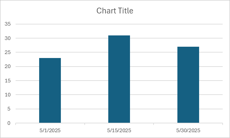
Here is an example of the origin table record and 3 related table records.
Origin Table
OBJECTID = 1
PRIMARYKEY = A0001
ADDRESS = 123 Any Street
Related Table
OBJECTID = 12
FOREIGNKEY = A0001
MOWDATE = 05/01/2025
MOWTIME = 23
OBJECTID = 13
FOREIGNKEY = A0001
MOWDATE = 05/15/2025
MOWTIME = 31
OBJECTID = 14
FOREIGNKEY = A0001
MOWDATE = 05/30/2025
MOWTIME = 27
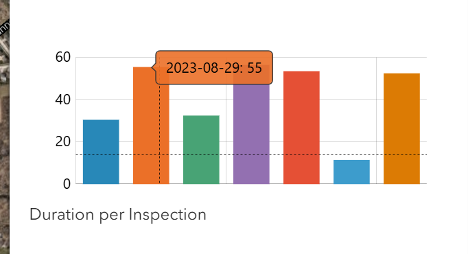
The resulting chart needs to resemble this image.
Thank you for any assistance.
Adam